Friday, 29 January 2016

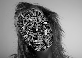
Jiri Kolar styled image and layered faces.


I decided to focus my project on identity. I first photographed my model inside the studio, then using photoshop, I replaced her face, and in one photo her skin with overlaid images (cigarettes and clouds) using a layer mask. The reason for the choice of images and the monochrome colour schemes was to identify tranquility and rebellion. The female I used in the shots was a young teen (15). I used cigarettes to illustrate the rebellion a lot of young teens have. They turn to drinking or smoking, underage, and it is to rebel against societies rules. Although, a lot of the time, these people are using the rebellion to gain credit or appreciation from the other young people around theme and in fact this rebellion is not them, they are someone else (represented by clouds). The reason I chose not to include the models face is because I wanted to illustrate how common the above statement is, and that it is not just this one teen that turns to this way of thinking, but actually a vast majority. 
Dimensions: A4, 21 x 29.7 cm, 8.3 x 11.7 inches.  


Jiri Kolar Styled Image

I found a great interest in the artist Jiri Kolar. I found his images highly creative and his style inspired me to recreate his pieces using my own materials. I decided to use Photoshop, as I wanted to interpret a digital spin on Kolar's work. I shot my images outside, adjusted them on Photoshop. I positioned one image on a separate layer than the other (so one image was hidden as below the other) and then by using a template of vertical lines, I used the magic wand tool to get the desired template and remove it for the above photo. I then deleted the template layer, and changed the layers to a monochromatic colour schemes as the tonal range, shadows and highlights looked much more vivid and capturing when monochromatic. Dimensions: A3, 29.7 x 42 cm, 11.7, 16.5 inches. 

Lipstick logo design

Art foundation project Design.

I decided for this project to design an app which would target a young audience. I wanted my app to revolve around make-up and beauty techniques for a younger generation. 
I designed the app layout using photoshop to produce the designs. I wanted to include some patterns along with bold colours and a noticeable popular makeup item. I decided to use a lipstick as this is a popular item among most ages. 
I started with a bold colour for the background. Then I placed a pattern that I found online, inverted the colours. The I placed the lipstick on a layer above this. Then on a new layer using the marquee tool I created a square, filled it with a colour and then changed the blending mode to luminosity, then duplicated the square and moved it to the opposite corner. 
I couldn't decide which colour scheme I preferred overall, plus I felt that the three worked really well together. Dimensions: A5, 14.8 x 21cm, 5.8 x 8.3 inches. 

Rape Awareness

 Project - Issues you feel strongly about.

I already knew from the project brief where I would base my work. I started with research on graphic posters and especially public awareness posters to see what type of imagery or typography they commonly used. 
From my information gathered in my research online, I found that the majority of posters consisted of manual designs such as photography using real models, or using a picture of something relating to the awareness and some bold typography overlaid on the image. 

Although these are professional designs, I found that some seemed slightly comical about something serious, or the design was irrelevant to the message. Sometimes the font wasn't capturing my eye and was a bit dull and other times the caption or slogan wasn't thought-provoking or interesting but just stating a point. 


I  designed all three designs using photoshop. 
The first image (NO MEANS NO) was created with a template for the hair, the glasses and lips, I designed on a separate layer. Then with the background I decided to use colours which were bright to capture the readers attentions, so using the pen tool I was able to divide the background into separate layers. Then using a city brush I found on Deviantart, I used a low opacity to produce the faint city line. 


With the two other designs, I used images I had photographed in advance to trace using the pen tool on photoshop the create a cartoon-like appearance to the subjects. I added a shadow on the font in the cup photo and with the outfit design, I used the marquee tool to produce bold backgrounds for the typography so that it stood out against the complex background. 
Dimensions (all): A4, 29.7 x 42, 11.69 x 16.53 inches.

Graffiti face

Art foundation media 1 Project.
Given a set of coordinates, take pictures of your surroundings and create a design.
 I started my project by photographing the graffiti around the skate park (our given location). I found a drawing of a face on the side of a ramp. I found it to be so interesting and quite a beautiful drawing in such a plain, inelegant surrounding. I found the piece juxtapositional to the rest of the art around the location. 
After photographing many different designs in the park, I decided to focus mostly on the face and what I could create from research linking towards my image. 
I decided to focus on the ideas behind presentation, mostly to do with ones characteristics and their traits. 
I felt that the way we present ourselves is different to everyone and out personality can be read differently by everyone, but our appearance is always seen the same. (as in exact appearance not in sense of beauty/attractiveness).
Created image on Photoshop, designed typography on photoshop. Dimensions: A4, 29.7 x 42 cm, 11.69 x 16.53 inches. 

Thursday, 28 January 2016

Album Cover

During my photography A-level course. A project I had been set was to either re-create an album cover or to create my own. I decided to do both of these, to explore both ways I could undergo this project. 
I started with the re-creation of an album cover. I started my research on popular music that I like, especially in the house or underground genre. After my researched, I found Disclosure. I find their artwork incredibly individual and I have never seen designs similar to theirs. 
To create these designs, I first photographed my models in the studio. Then using Photoshop I pasted the typography from the original album artwork onto my images, applied a colour lookup to enhance the tones in the image, and then using then pen tool on a separate layer, I produced the popular line design, evident in all of disclosures album artwork. 


With my own design, I wanted to produce something similar to disclosure's artwork. I started with creating my own background by using photoshop and the pen and marquee tool to produce different coloured shapes. Once the background was created, I photographed my model in the studio, and then converted the image into B&W as I find it easier to trace my images on photoshop using the pen tool when the image is monochromatic as the tonal range is clearer to see as well as the highlights and shadows. Dimensions (all): A5, 14.8 x 21 cm, 5.83 x 8.28 inches. 

Sylvia Plath study

Project criteria - pick a quote from list and create a poster (focusing mostly on typography) to illustrate your chosen quote. 
I decided to research the quotes which I found had the most interesting wording. When exploring "I desire the things which will destroy me in the end" I found it was from the novelist and poet, Sylvia Plath. 
Furthermore, I researched Plath to understand her history and character behind this quote. I found she had quite a dark, sad life, suffering from depression and a rocky relationship with Ted Hughes. After I had learn more about Plath and her history, I felt I could grasp more of her identity and more of the feelings behind the quote through my work. I wanted to produce a strong bold type, as Plath was a very strong woman to begin with, early on in her life. I then wanted to illustrate the struggle and the pain that was experienced, so by this I created the rip on the design.
I produced two copies of two different colours schemes to illustrate the exploration of the colours that could work with my design. I produced these designs on Photoshop, using the lasso tool to produce the rip. Dimensions: A4, 29.7 x 42 cm, 11.69 x 16.53 inches. 

Tuesday, 26 January 2016

Drawing of Bulbs

Using drawing inks I produced some observational drawings of old bulbs. I then used some dark red ink to add more of an interesting effect to the drawings rather than just keeping the image in a monochromatic theme. I usually prefer digital schemes of working as apposed to practical but I enjoyed producing this art and found it to be thoroughly effective. Dimensions: 29.7 x 21cm, 11.7 x 8.26 inches.

Cartoon Shoot in style of Nick Knight

A level - Photography Project. 

After exploring Nick Knight's projects, I came across one of his popular works, 'Text Talk'. I found the work capturing as not only did it include photography but also a lot of mixed media. I found the use of the captions in iPhone's text bubble format very interesting and also added a slight witty or comical sense to the design, along with the emoji's. I created my design by first taking a photograph of my model in the studio, then enhancing it using photoshop so I was able to trace around the image on a separate layer. I then used a fake text generator to produce the caption for the image. 
Dimensions (Digital): A4 21 x 29.7 cm, 8.27 x 11.69 inches. 


  Scan of single shoot work (A-Level Photography) 
Dimensions: A3 29.7 x 42 cm, 11.69 x 16.53 inches.

Xmas Project

Christmas Project. Relate to traditional Christmas themes and ideas. I decided to focus my work on popular Christmas themes, rather than relating my work to older traditions. I wanted to create work which could be advertised on Christmas cards or even tags to apply presents or gifts. 
I wanted both designs to be quite simplistic, yet aesthetically interesting. I created the reindeer design using Photoshop, by using a reindeer template I found online. Then on a separate layer, using the pen tool to create the triangles and filling them in with the desired solid colour. 
Dimensions: A4 21 x 29.7 cm,  8.27 x 11.69 inches.  


In this design consisting of the parallel monochrome lines and Santa Claus. I also created this design in Photoshop. I used an image for the parallel lines I found online and then the marquee tool to create the three circles, I included the other features present on separate layers. 
Dimensions: A4 21 x 29.7 cm,  8.27 x 11.69 inches.  

Wednesday, 20 January 2016

Screen Print


Project based on social/ethical issues that I find important. I decided to focus my project on feminist views and anti-rape notions. Starting why my research on other posters linking to the same or similar subjects, I established that bold statements with an interesting type choice stood out more than not only bold and simple but to express my desired message across easily. I chose to create a screen print and use two different colour schemes to add an interesting 3D effect. Dimensions = A3 29.7 x 42.0 cm, 11.69 x 16.53 inches.